Visual Inconsistencies: WinXP
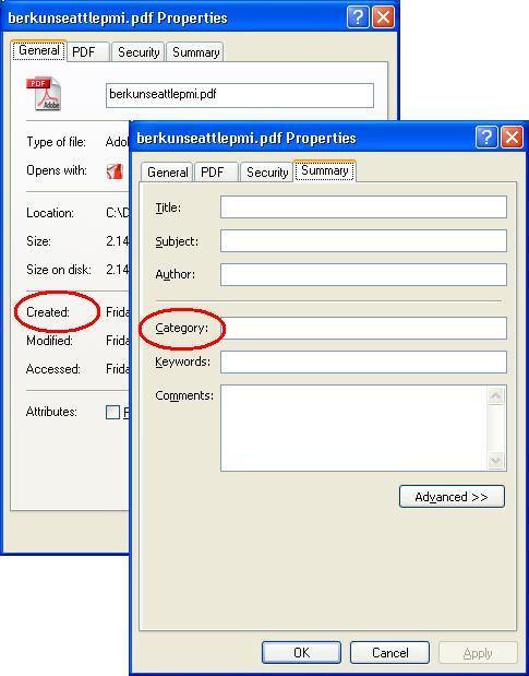 Properties Window everywhere in WinXP adorns MS Sans Sarif font, glaringly diffent with otherwise "omni"present Tahoma, even that would have been a reasonably consistent UI scheme. But what is surprising that even the fonts across tabs are not consistent.
The font in 'Summary' tab is Tahoma, while all other tabs have MS Sans Sarif. For UI-challanged, look for a 'C' in 'Summary' tab and that in any other tab.
The Win2000 has Tahoma everywhere but the Properties window, which has MS Sans Sarif, consistently.
Take this proclaimed expert of Visual Design.
posted by Brajesh @ 10:30 AM
2 comments
![]()
![]()

2 Comments:
I just Microsoft's San Serif font. Tahoma is much cleaner, and more readable.
Microsoft is known for it's consistency *cough, cough, rolls eyes*....
There were even more incosistencies across diffrent editions of WinXP, and then I lost all hope to justify it somehow:)
Post a Comment
<< Home